TYPE
They’re just glasses, but they’re more than just glasses
This might come out of the blue, but do you wear glasses?
Yes, those glasses. I wear contact lenses when I go out, but at home I’m a devoted glasses wearer. My eyesight is really poor, so I wear them all the time except when I’m asleep.
I’ve got a few pairs, but I usually stick to the same ones. They’re lightweight glasses with slightly reddish frames. I was torn between black frames and these, but in my case, going for the red ones was the right choice. They just feel right and they’re my favourites.
Do you have any particular preferences when buying glasses? Personally, I prefer materials that don’t cause discomfort when worn. After all, as I wear them all the time, heavy ones are a real strain. Then there’s the size of the frames. If they’re too small, they look odd, and if they’re too big, they look a bit clunky, don’t they?
Haven’t you ever felt a bit overwhelmed when you go to an optician’s because there are so many types to choose from? I certainly have. I end up thinking, ‘Any of them will do.’ But as glasses practically become an extension of your body, if you don’t choose carefully, you’ll end up regretting it later.
There’s a whole world to glasses. Here, I’m going to take a little peek into the world of eyewear. I hope you’ll stick with me.
The TYPE brand
I imagine some people choose their glasses based on the brand. You buy them because you like the brand. That’s a perfectly valid reason. But what about choosing glasses based on their concept?
Screenshot of the Type logo
The ‘TYPE’ range of spectacles is designed around the concept that, just as different fonts can alter the way a message is conveyed, so too can different frames change the impression a wearer makes. It’s a wonderfully creative idea to draw inspiration from typography.
This ‘TYPE’ brand was launched in 2015 by a company called Oh My Glasses, driven by a desire to deliver high-quality Japanese-made products to the world. From the concept and design right through to the shopping experience, every detail has been meticulously considered, making it a brand that truly exudes an extraordinary level of dedication.
The parent company, Oh My Glasses, was established in 2011. Whilst studying in the United States, the company’s president heard people around him say that ‘Japanese products are reliable’ and ‘of high quality’. This made him realise once again the excellence of Japanese-made goods, and he launched the company based on the philosophy that the merits of Japanese manufacturing should not be monopolised by the Japanese alone, but shared with people all over the world.
It is a brand that offers more than just a one-off sale; it exudes a sense of warmth. A brand you’ll want to stay loyal to for the long term – that, I believe, is the true appeal born from the ‘TYPE’ concept.
Which style do you prefer?
Let’s take a look at the 12 flagship models from ‘TYPE’.
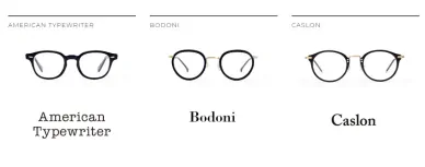
Screenshots of Type products.
- Helvetica
It is said to be the most widely used typeface in the world today. It was originally known as ‘Neue Haas Grotesk’, but was renamed ‘Helvetica’—the Latin word for Switzerland—with the aim of expanding its market reach. It subsequently became a massive hit and remains widely used to this day. As the design reflects the typeface’s highly versatile image, it is a framework suitable for any application. As it is used by companies such as Toyota and Francfranc, many people will likely recognise it. - Garamond
Garamond is still regarded as a standard typeface today. It was created in the early 16th century by the French typeface engraver Claude Garamond. It is a prime example of what is known as an ‘old-style serif’ and conveys a classic, intellectual image. - Din
Din is a German-born Latin typeface. Originally created for industrial use, the name ‘Din’ derives from the ‘German Institute for Standardisation’ (Deutsches Institut für Normung). It has a modern and solid image, and even the well-known Japanese brand Uniqlo uses this typeface. - Futura
‘Futura’ means ‘future’ in Latin. Whilst its simple and beautiful style catches the eye, it was actually created 90 years ago and has a long history. It is a font with a sophisticated image, used by brands such as Louis Vuitton and Supreme. - American Typewriter
This is a stylish typewriter typeface designed by graphic designer Milton Glaser. As it is used in the world-famous ‘I LOVE NY’ logo, many of you may have seen it before. Because it utilises ink, it exudes a unique, faded atmosphere. - Caslon
This typeface was created in the 1700s by the Englishman William Caslon. It has an elegant feel and is also known as the typeface used in the American Declaration of Independence. It is also said to have been a favourite of the scientist Benjamin Franklin. Although various font manufacturers produce versions of it, Adobe Caslon is the best known as it is included as a default in Illustrator. - Bodoni
A Latin typeface designed in the early 19th century by the Italian printer Giambattista Bodoni. It excludes calligraphic elements and is frequently used in advertising design and the fashion industry. Its delicate and elegant forms are particularly popular. - Optima
This font was created in 1950 by the German typeface designer Hermann Zapf, who drew inspiration from Italian inscriptions. It is popular for its timeless, refined and beautiful forms. Gucci and Godiva also use this font. - Copperplate
It was created in 1901 by the American Frederick Gaudy, who became a typesetter at the age of 40. Each character fits almost perfectly within a square face, giving it a decorative yet somewhat charming appearance. It is frequently used by high-end food and drink establishments such as Dean & Deluca and Kihachi. - TIMES NEW ROMAN
This typeface was developed in 1932 by The Times of London as a newspaper typeface. It was designed with the readability of body text in mind. It came into widespread use from the 1940s onwards and is included as standard in Windows. Owing to its high visual quality, it is used extensively for everything from headlines to body text, and is a typeface that does not cause eye strain even when reading long passages. Although it is no longer used by The Times, it remains very common in books and general printing. - Eurostile
A geometric typeface designed by Aldo Novarese in 1962. With its large, rounded square design, it has a mechanical feel and is particularly well-suited to headlines and symbols. It became especially popular in graphic design, science fiction works and the media produced from the 1960s through to the 1970s, and for a long time virtually monopolised the typeface used in science fiction novels. It has also been adopted by companies such as Toshiba and Casio. - Univers
This typeface was created in 1957 by the Swiss graphic designer Adrian Furtiger. It conveys a more elegant, powerful and refined impression than Helvetica, and is widely used as a standard typeface. It is utilised by Swiss International Air Lines, Frankfurt am Main International Airport in Germany, Deutsche Bank and Sanyo Electric, amongst others.
As described above, each model faithfully recreates the image associated with its respective font. To an ordinary person like me, the idea of turning a font into a pair of glasses is a rather surprising concept. Yet it works surprisingly well and looks very stylish. The distinctive characteristics of each font are skilfully incorporated into the frames, making you appreciate just how wonderful design can be.
Where to Buy
Having introduced them all this far, I can’t just leave it at that, so let me briefly tell you where you can buy them.
I think the best place to buy them is the Oh My Glasses online shop. It’s the official site, so you can shop with confidence. Some models are discounted, so be sure to check them out.
[Online Shop]
At the online shop, you can select up to five pairs of glasses that catch your eye and try them out for free for five days.
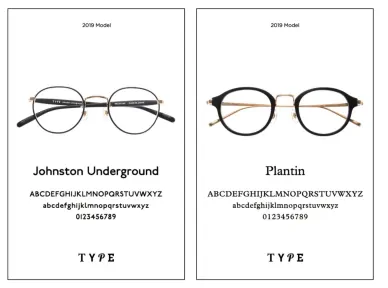
Screenshots of the 2019 model
Choose five pairs of glasses that catch your eye- Try them on at home once your selection arrives
- Free returns and free delivery for five days
- After purchase, you can access a range of services—including fittings, repairs, cleaning, lens replacement and eye tests—at any of the 1,000 Oh My Glasses TOKYO partner shops across Japan
You used to be able to make purchases via the URL ‘type.gs’, but the current URLs are as follows:
Official website address
https://www.ohmyglasses.jp/
TYPE sales page
https://www.ohmyglasses.jp/brands/type
[Stores]
There are, of course, physical stores too. There are eight locations nationwide. They offer free eye tests, as well as fitting, cleaning and repairs. If you’re in the area, why not pop in?
[Tokyo]
Shibuya Koen-dori Store (GRAND OPEN: 22 July 2020)
Address: 4F, Jinnan Kogyo Building, 1-20-10 Jinnan, Shibuya-ku, Tokyo 150-0041
Access: 5-minute walk from JR ‘Shibuya’ Station; in the building next to the Apple Store
Telephone: 080-7652-0483
Opening hours: 12:00–21:00
Tokyu Plaza Ginza Branch
Address: HINKA RINKA Ginza, 5th Floor, Tokyu Plaza Ginza, 5-2-1 Ginza, Chuo-ku, Tokyo 104-0061
Access: 1-minute walk from Exits C2 and C3 of ‘Ginza Station’ (Tokyo Metro Ginza, Marunouchi and Hibiya Lines); or 2-minute walk from Exit A1 of ‘Hibiya Station’ (Tokyo Metro Hibiya and Chiyoda Lines, Toei Subway Mita Line); or 4-minute walk from the Ginza Exit of ‘Yurakucho Station’ (JR Yamanote and Keihin-Tohoku Lines)
Telephone number: 070-2832-0117
Opening hours: 11:00–21:00
Shinjuku East Exit Branch
Address: 2nd Floor, Konwa Centre Building, 3-26-3 Shinjuku, Shinjuku-ku, Tokyo 160-0022
Access: 2 minutes’ walk from the Central East Exit of JR Shinjuku Station, or 3 minutes’ walk from Exit A5 of Tokyo Metro Shinjuku-sanchome Station. Turn into the street next to ‘Megane Super’, and the shop is on the 2nd floor of the building opposite Shinjuku Musashino-kan, on the ground floor of which is the brand buy-back shop ‘BirthDay’.
Telephone number: 03-6273-0376
Opening hours: 11:00–20:00
Esola Ikebukuro Branch
Address: 4th Floor, Esola Ikebukuro, 1-12-1 Nishi-Ikebukuro, Toshima-ku, Tokyo 171-0021
Access: Directly connected to the exit of ‘Ikebukuro Station’ on the Tokyo Metro Yurakucho Line; directly opposite the South Exit of ‘Ikebukuro Station’ on the JR Yamanote, Saikyo and Shinjuku-Shonan Lines; or directly connected to Exit 4 of ‘Ikebukuro Station’ on the Seibu Ikebukuro, Tobu Tojo, Tokyo Metro Marunouchi and Fukutoshin Lines. Located on the 4th floor of the ‘Esola Ikebukuro’ shopping centre, next to the bookshop and coffee shop ‘Fukuro Shosabo’.
Telephone number: 03-6709-2644
Opening hours: 10:30–21:30
[Kanagawa Prefecture]
Yokohama Loft Branch
Address: 7th Floor, Sogo Yokohama, 2-18-1 Takashima, Nishi-ku, Yokohama City, Kanagawa Prefecture 220-0011
Access: 8-minute walk from the East Exit of ‘Yokohama Station’ on the JR Line, Keikyu Main Line, Tokyu Toyoko Line, Sotetsu Main Line, Yokohama High-Speed Railway Minatomirai Line and Yokohama Municipal Blue Line
Telephone: 045-534-7761
Opening hours: 10:00–20:00
[Kyoto Prefecture]
Kyoto Branch
Address: 605 Teian-mae-no-chō, Teramachi-dōri, Shijō-sagaru, Shimogyo-ku, Kyoto City, Kyoto Prefecture 600-8031, Fujii Daimaru 4F
Access: Approx. 2 minutes’ walk from Hankyu ‘Kawaramachi Station’; approx. 5 minutes’ walk from Keihan Main Line ‘Gion-Shijō Station’; approx. 5 minutes’ walk from Kyoto Municipal Subway ‘Shijō Station’
Opening hours: 10:30–20:00
Telephone number: 080-8918-0957
[Osaka Prefecture]
Umeda Tsutaya Bookstore
Address: 9F LUCUA ERE, 3-1-3 Umeda, Kita-ku, Osaka City, Osaka Prefecture 530-8558, Umeda Tsutaya Bookstore
Access: JR ‘Osaka Station’ and ‘Kitashinchi Station’; various private railway lines ‘Umeda Station’; Midosuji Subway Line ‘Umeda Station’; Tanimachi Subway Line ‘Higashi-Umeda Station’; Yotsubashi Subway Line ‘Nishi-Umeda Station’. Osaka Station City North Gate Building, West Wing, ‘LUCUA Osaka’ shopping centre (LUCUA Osaka) Inside ‘LUCUA 1100’ (LUCUA Eire), 9th Floor, Books & Culture Floor
Telephone: 06-6136-8550
Opening hours: 10:00–21:00
[Tottori Prefecture]
Oh My Glasses Yonago Branch
Address: 2-4-1 Shinkai, Yonago City, Tottori Prefecture 683-0801, The School of Books, Media Building
Access: [Bus] Take a Nikko Bus or Hinomaru Bus from ‘Yonago Station’ bound for ‘Sangyo Taiikukan’ (Industrial Gymnasium), alight at ‘Sangyo Taiikukan’, then a 1-minute walk. [By car] Located along National Route 431; 700 metres west of the ‘Kaike’ junction when coming from the direction of Hiyoshi-tsu Village; opposite the ‘Sangyo Taiikukan’ when coming from the direction of Sakaiminato.
Telephone number: 0859-21-5009
Opening hours: 10:00–19:00
Designer Interviews
Here, we present excerpts from interviews on typefaces conducted with three internationally renowned designers.
- Akira Kobayashi (Type Director at Monotype)
We spoke to Akira Kobayashi, who is based in Germany, about the popular ‘Din’ and ‘Futura’ typefaces. ‘Both Din and Futura are typefaces of German origin, but if we go further back in time, there is a traditional script known as Blackletter, which has been in use since the days of Gutenberg, the inventor of movable type. They are called ‘Blackletter’ because the vertical strokes are emphasised, the character width is narrow, and the page appears predominantly black when this typeface is used; in Japan, however, they are also known as ‘German type’. The Din typeface is characterised by a mechanical form that omits subtle nuances in its curves; to put it bluntly, it lacks any real character. However, precisely because of its lack of individuality, it can be used in any context, and it began to attract attention, particularly amongst designers, from around the 1990s. ‘Futura is characterised by its highly geometric form. Its structure, which appears to be created through a combination of circles and straight lines, is fascinating; yet, precisely because it lacks any peculiar individuality, it is highly versatile and can be used in any context—which, I believe, is the reason it has continued to be loved for so long.’ - Yukiko Uno & Kazuhiro Yamada (Font Creators)
We spoke to Yukiko Uno, the designer of the Japanese typeface ‘Kōzei’—which won the Type Design Award at the Tokyo TDC Awards 2014 organised by the Tokyo Type Directors Club—and Kazuhiro Yamada, who handled the engineering.
Ms Uno: ‘I learnt that creating characters is the same as creating language. What matters to the reader is the content written there, not the characters themselves. However, in order to convey that content in the best possible way, the characters need to be neatly arranged; and that is precisely why I find it appealing that they remain an unobtrusive presence. That approach to characters, and that simple purpose, suits me well and gives me a real sense of fulfilment. As characters have forms that have been passed down over a long period, designing a typeface isn’t actually a particularly free-form process; but that is precisely why I want to cherish the characters that have been preserved throughout the long history of calligraphy.”
Mr Yamada: “Fonts need to be created through a collaboration between designers and engineers. In my case, as I needed engineering skills to convert the characters I’d designed into a font, I learnt the process by being taught by others. However, in my view, design and engineering exist on an equal footing, and I believe I must study both with equal dedication.” - Mr Takahisa Shirai (Graphic Designer)
We spoke to Mr Takahisa Shirai, one of Japan’s leading graphic designers, who specialises primarily in magazine and book design.
‘Typefaces are a powerful reflection of culture and the times. I believe that by understanding not only the form of each typeface but also its background and history, one can delve deeper into its appeal. One aspect of a designer’s work is to understand the background of typefaces and select them according to the time, place and occasion. The subtle differences between typefaces aren’t a major issue for the viewer. However, even so, the viewer must be sensing something on a level that cannot be put into words, and the ability to manipulate that aspect is part of what makes design so fascinating. (…) I imagine that wearing formal attire and ‘GARAMOND Regular’ glasses would be a perfect match, but if you were to deliberately pair it with ‘HELVETICA Bold’ instead, it might actually work surprisingly well. Furthermore, whilst it might suit Person A, it might not suit Person B. In the sense that you cannot make a definitive decision simply by following a manual, the joy of choosing ‘TYPE’ is similar to that of selecting typefaces, and I feel it really hits the right note.”
In conclusion
These days, the spotlight has long been on decluttering, simple living and minimalist lifestyles. It’s natural to yearn at least once for a light, unburdened life where non-essential possessions have been pared down to the bare minimum. Spending no money on frivolities, yet being generous where it matters. This brand exudes a cool yet gentle image that seems to align perfectly with that way of life. A new pair of glasses as the first step towards a streamlined lifestyle—I don’t think that’s such a bad idea.