UNC Inclusion Project: Mapping Segregation and Inequality in North Carolina
The Inclusion Project is an interactive mapping initiative created by the Center for Civil Rights at the UNC School of Law to document the spatial legacy of segregation across North Carolina. It connects where people live to concrete outcomes: access to housing, schools, infrastructure, political representation, and environmental safety, using an interactive map rather than a traditional written report.
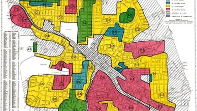
This kind of place-based research sits alongside a broader body of work exploring how geography shapes opportunity and everyday life around the world, from regional profiles such as this overview of Ireland to lighter online casino content covering an entirely different corner of digital life.
What Is the UNC Inclusion Project?
Who Created the Project and Why
The Inclusion Project is an initiative of the Center for Civil Rights at the UNC School of Law. Its underlying research was published in 2013 as a formal report, The State of Exclusion: An Empirical Analysis of the Legacy of Segregated Communities in North Carolina. The project's purpose is to document the legacy of segregated communities and make local inequality visible through mapped public data, rather than a written report most residents would never encounter.
Why a Map Can Matter to Communities
A map translates complex, layered datasets into a practical tool that non-specialists can use without a background in statistics. Readers can examine how demographic patterns overlap with schools, housing conditions, pollution sources, and local political structures, connections that are often hard to grasp from scattered agency reports but become clear once plotted onto a single shared map.
How the Project Identified Communities
What Is a Census Block?
A census block is the smallest geographic unit used by the U.S. Census Bureau. In dense urban areas it can resemble a single city block; in rural areas it may cover a much larger area with a smaller population. This granularity let researchers identify patterns at a genuinely local level rather than relying on broader county-wide averages.
The 75% Population Threshold
The methodology centered on a specific threshold: census blocks where at least 75% of residents identified as a race other than white alone, or as Latino, were selected for analysis. Adjacent qualifying blocks were grouped into contiguous clusters, displayed on the map in purple.
Nearly 3,200 Community Clusters
Using this method, the research identified nearly 3,200 clusters across North Carolina, ranging from a single census block to dozens of connected blocks. These clusters are an analytical model for examining potential patterns of exclusion, not a legal designation or proof of discrimination in any individual case.
What the Interactive Map Shows
Purple Areas and Community Demographics
Purple-shaded clusters represent communities meeting the demographic threshold. Hovering over a cluster revealed its estimated population, area, and majority or plurality racial group; clicking opened a more detailed profile.
Housing, Environmental, and Election Data
Each cluster profile combined demographics, housing conditions, environmental justice concerns, and the method used to elect county commissioners in that area, connecting a community's ability to influence local decisions to its demographic and environmental reality.
Environmental Risks: Pollution Sources and Waste Facilities
Orange Dots: EPA-Registered Pollution Sources
Orange markers identified facilities registered with the U.S. Environmental Protection Agency, with clickable links to official EPA records for that facility.
Yellow Dots: Solid-Waste Facilities
Yellow markers indicated open or closed solid-waste facilities permitted by North Carolina's environmental authorities. Waste facility siting has historically clustered near lower-income and minority communities nationwide, and the underlying 2013 research found African American residents in North Carolina faced substantially higher exposure to waste facilities than the statewide average (see Facing South's coverage of the original report).
Schools, Education, and Socioeconomic Indicators
School Data Available on the Map
Graduation-cap symbols represented public and charter schools. Profiles could include student racial demographics, grades served, and number of teachers, letting users connect a community's makeup directly to its local schools.
What the FRL Indicator Means
FRL refers to eligibility for free or reduced-price school meals, a commonly used indirect indicator of economic hardship among students' households rather than a precise measure of family income.
Forms of Inequality Examined by the Project
Access to Housing and Infrastructure
Inequality can appear through housing quality and unequal access to water, sewer systems, roads, and public transportation. The project treats these as possible patterns worth investigating, not automatic conclusions about every mapped area.
Political Representation and County Elections
How county commissioners are elected, at-large or by district, affects how much influence a community has over local budgets, zoning, infrastructure, school policy, and environmental permitting.
Why Historical Segregation Still Matters
How Long-Term Inequality Develops
Historical housing restrictions and land-use decisions can contribute to residential separation that persists after the policies themselves are repealed. Unequal investment over subsequent decades can compound that separation, reinforcing inequality across generations.
Example: A Community Near an Industrial Facility
Consider a predominantly non-white community near a landfill or industrial site. A map like this can prompt useful questions: What permitting history led to the facility's location? Is emissions monitoring in place? Were alternative sites considered? Proximity alone does not prove harm; establishing real impact requires additional evidence.
Limitations of Inclusion Project Data
Why the Data Needs Updating
The archived version relies substantially on 2010 U.S. Census data. Population patterns, housing conditions, schools, pollution sources, and election systems may have changed since then, so the map should be treated as a historical snapshot rather than a live record.
What the Map Cannot Prove by Itself
The map identifies spatial patterns worth investigating but cannot establish causation on its own. Strong conclusions require updated data, local government records, environmental assessments, and area-specific research.
Who Can Use the Inclusion Project?
Residents, Journalists, and Community Groups
- Residents can explore conditions in their own neighborhoods.
- Journalists can use mapped patterns to identify questions worth investigating.
- Advocacy groups can use the data to support evidence-based requests to local government.
- Researchers can compare place-based indicators across regions.
- Public officials can assess the real-world impact of existing policies.
This range of uses turns a legal research project into a practical resource for public accountability and civic engagement across North Carolina.